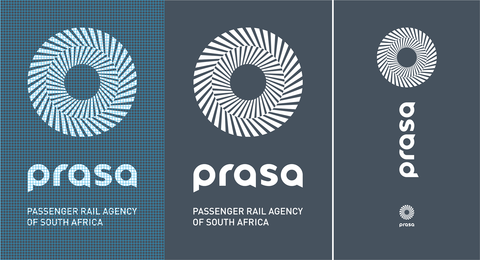
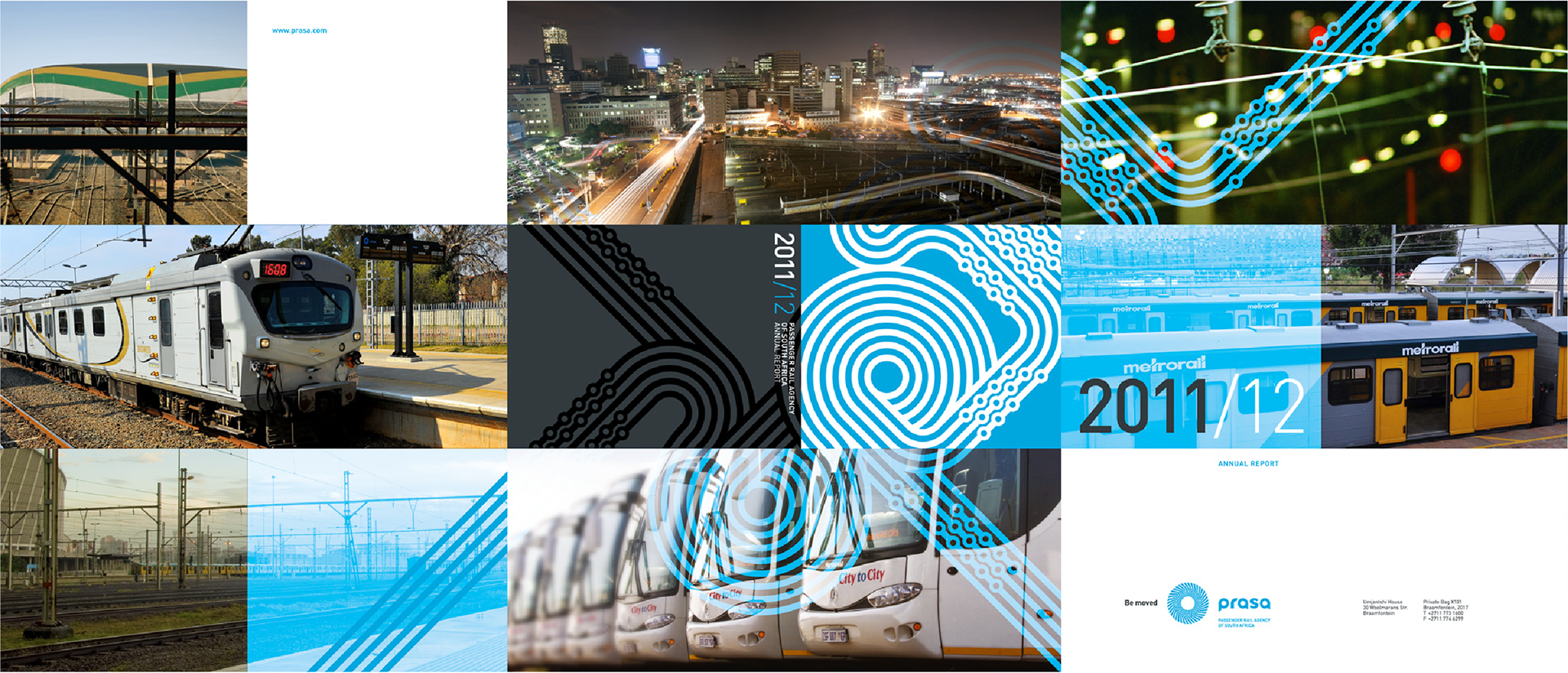
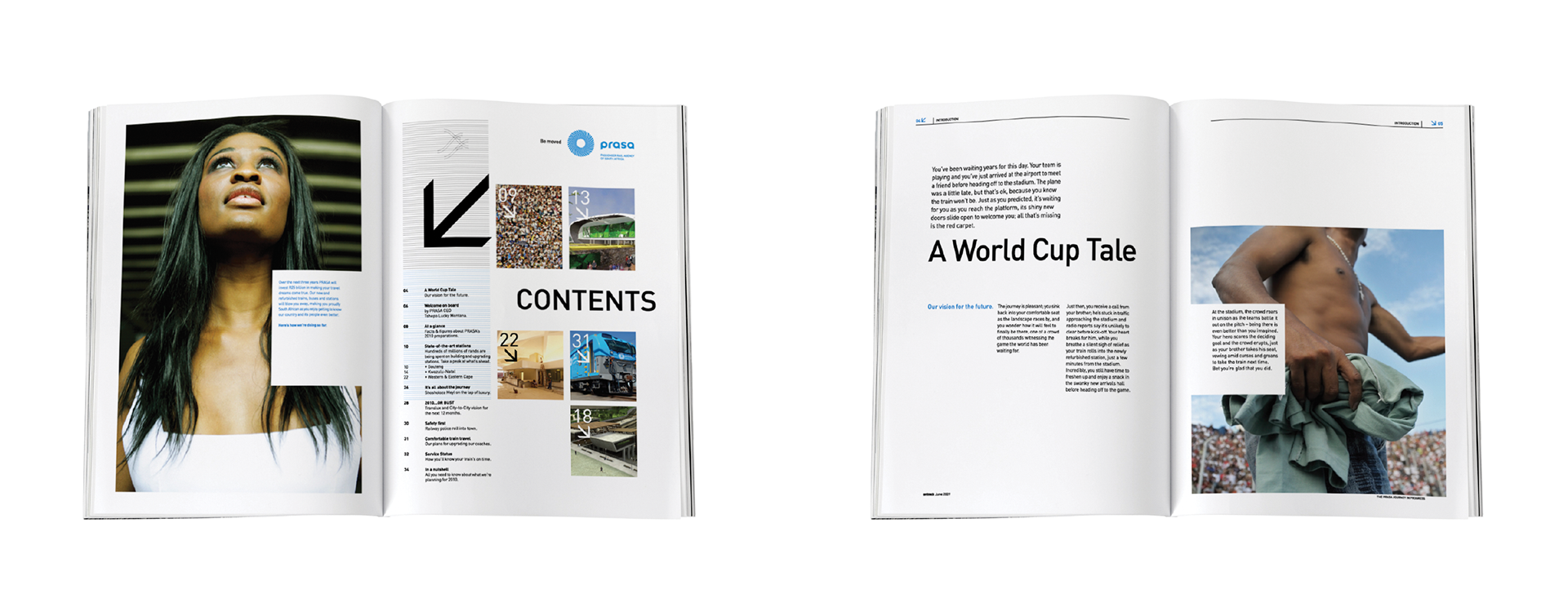
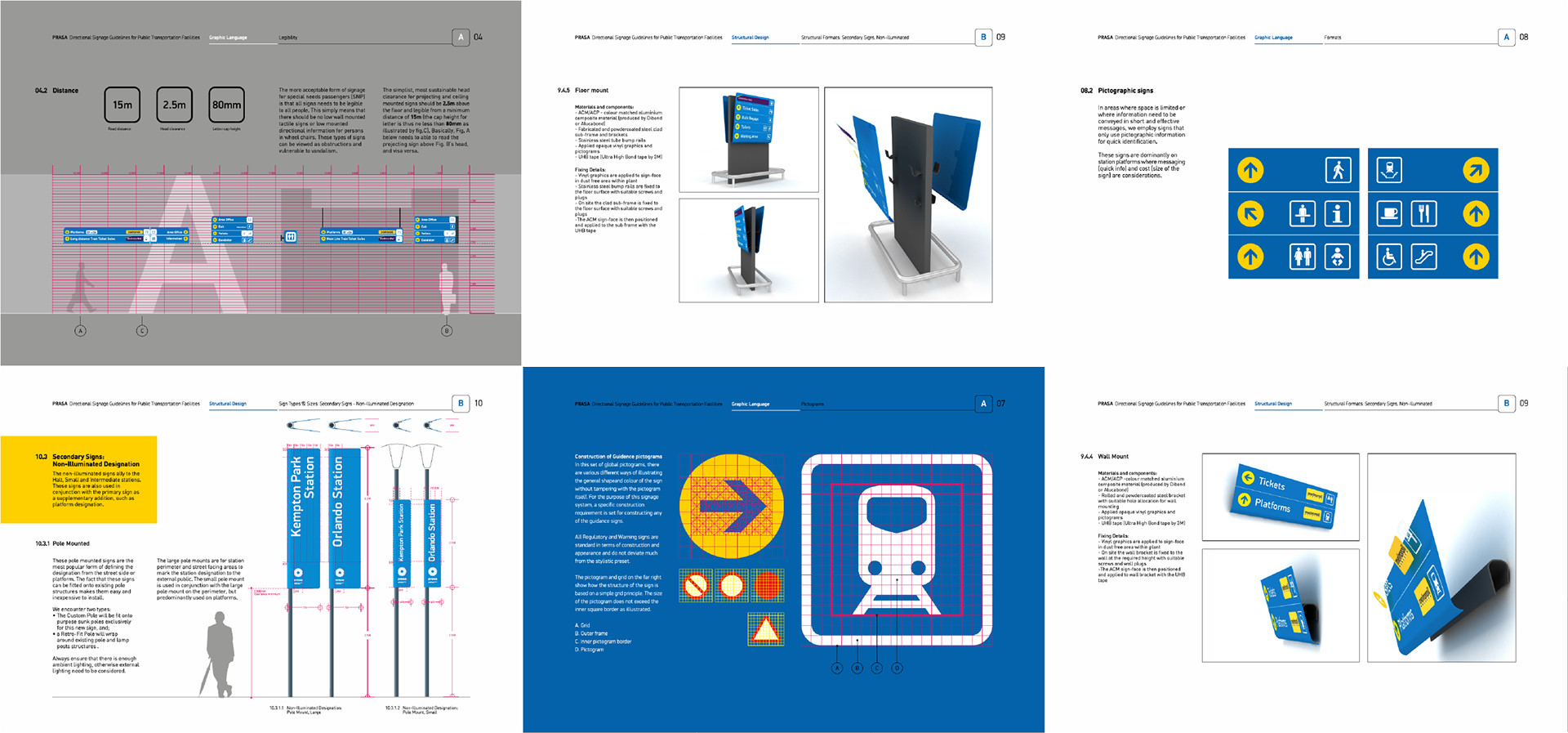
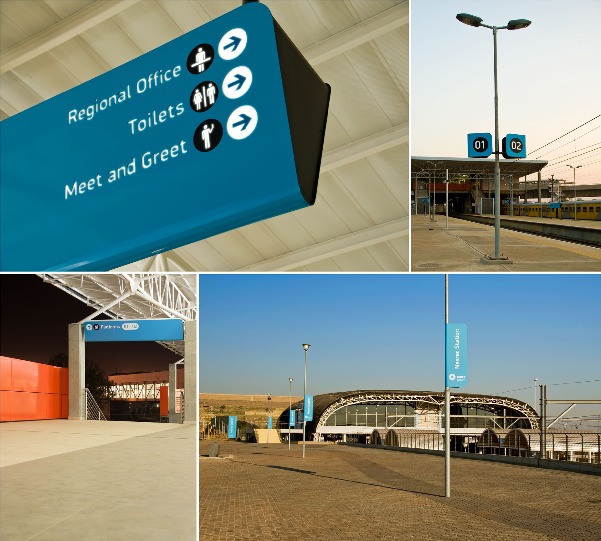
Brand identity, communication collateral and communication design for the Passenger Rail Agency of South Africa. The brand icon (logo) is a very simple and effective idea - two concentric circular patterns that slant in opposite directions create a moving optical illusion. Each of the circles represent the two core passenger transport concerns namely 'road' and 'rail'. The project also extended into a public way finding system and commuter transport collateral such as rail route maps - an exercise undergone for the first time in South African commuter history. This re-brand won ReBrand 100 'Best of Show', 2013.