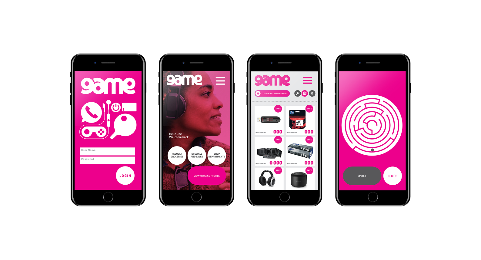
Game is South Africa's oldest surviving retail brand with nearly 50 years of trading. Since the early 1070's Game has not updated or even refreshed its core brand identity. With contemporary means of shopping, a whole new market and a rapid influx of competitor spaces on the rise, it seemed that an update was somewhat overdue. The business focus needed to shift to the needs and demands of a modern South African market and the brand needed to visually reflect a change in attitude. The brand mark (which is much loved and recognised) needed not shift too much, but the communication tools and house style needed a lot of improvement. It desperately needed a coherent brand story, the online offering was virtually non-existent and the in-store experience was failing.
The project was undertaken in collaboration with Sheila McGillivray from One Lady and a Tribe.
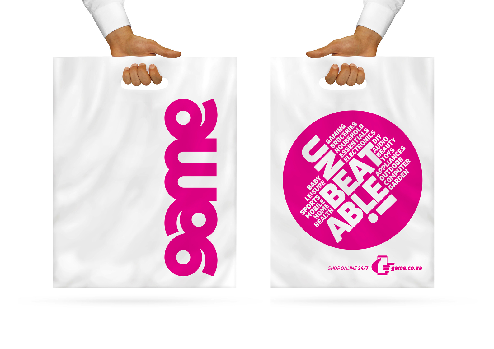
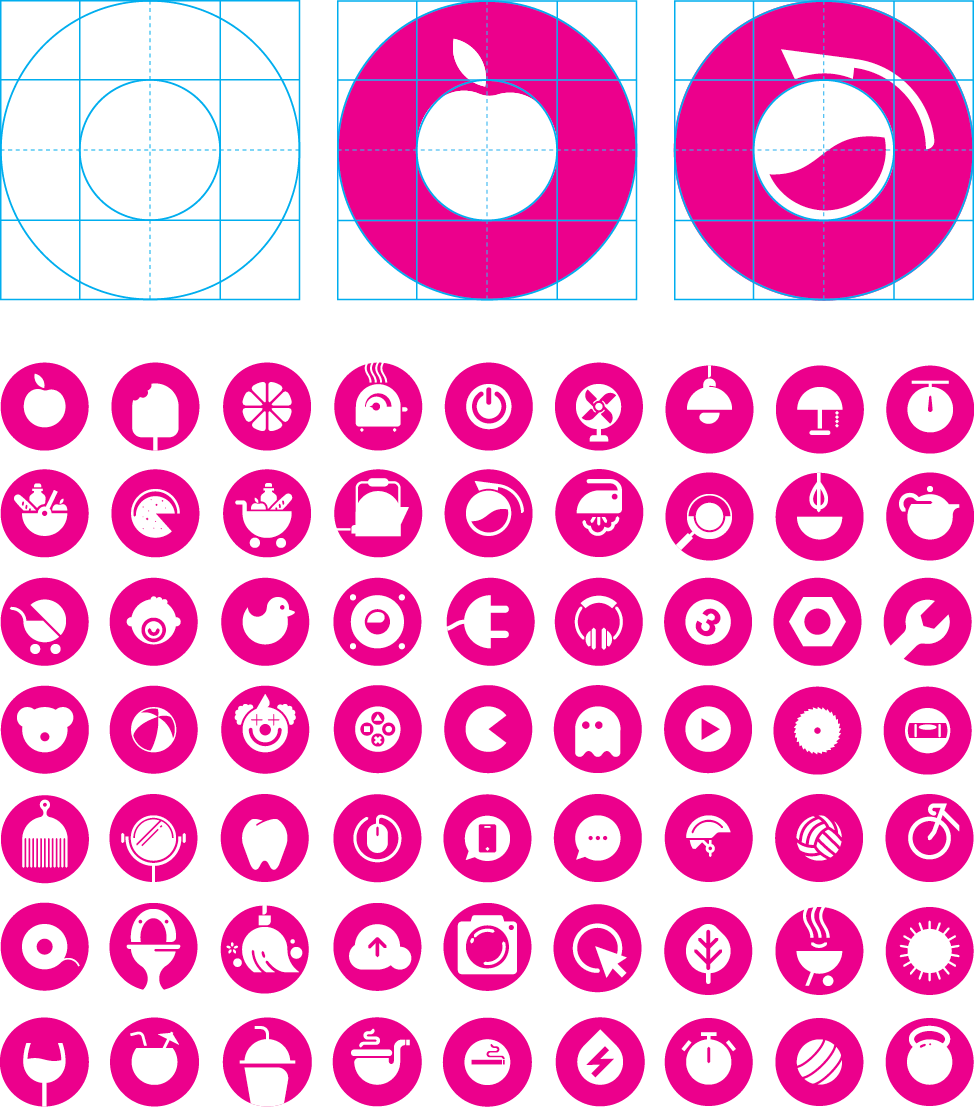
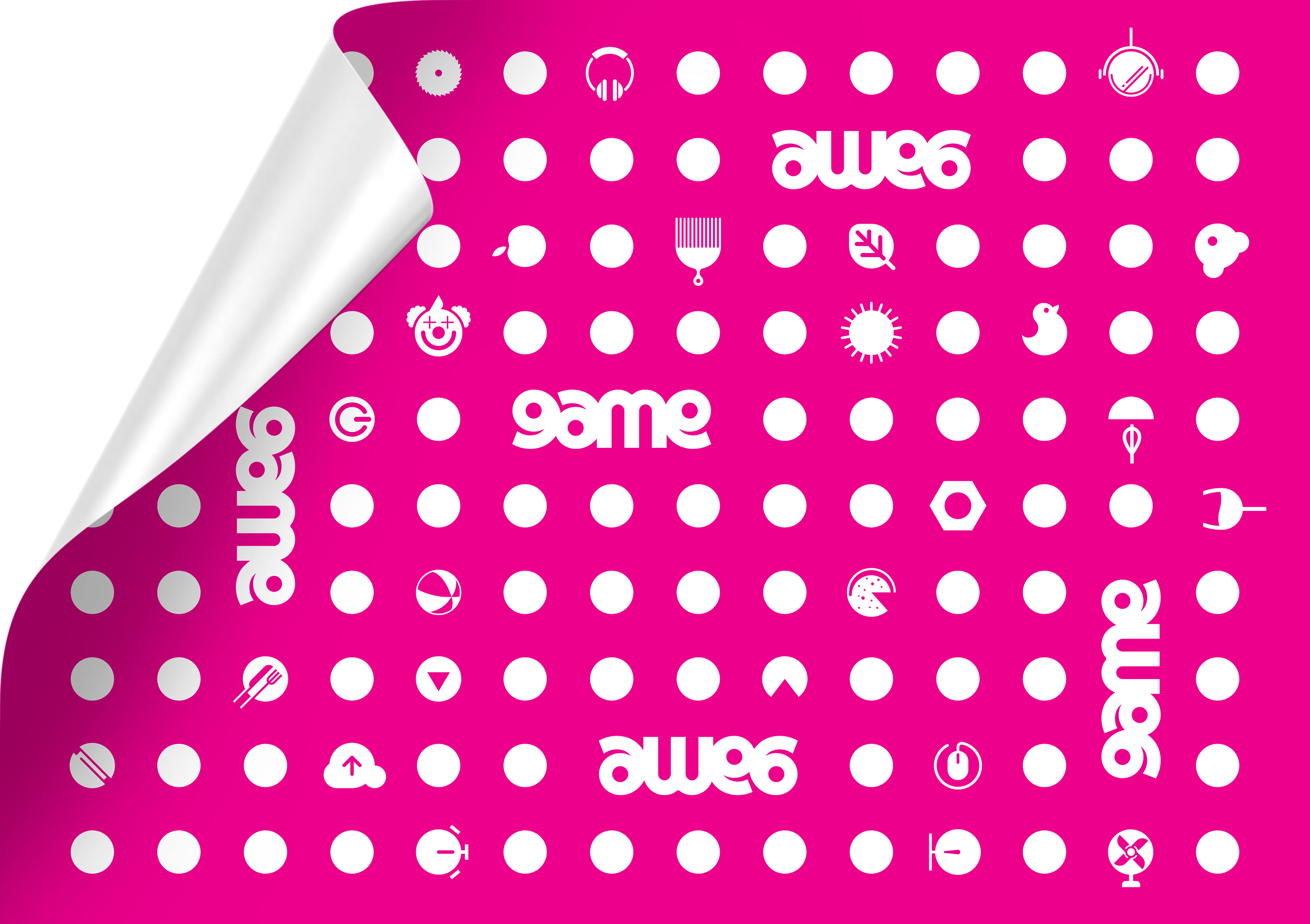
The simplest form of an associated graphic is the ‘dot’. The dot is inherent in the structure of the brand mark and is simple enough to be a recognizable shape that is visually tied to the brand. The combination of the simple dot with the Game pink colour is unique in the retail space and given enough exploration, can be owned as an equitable shape.
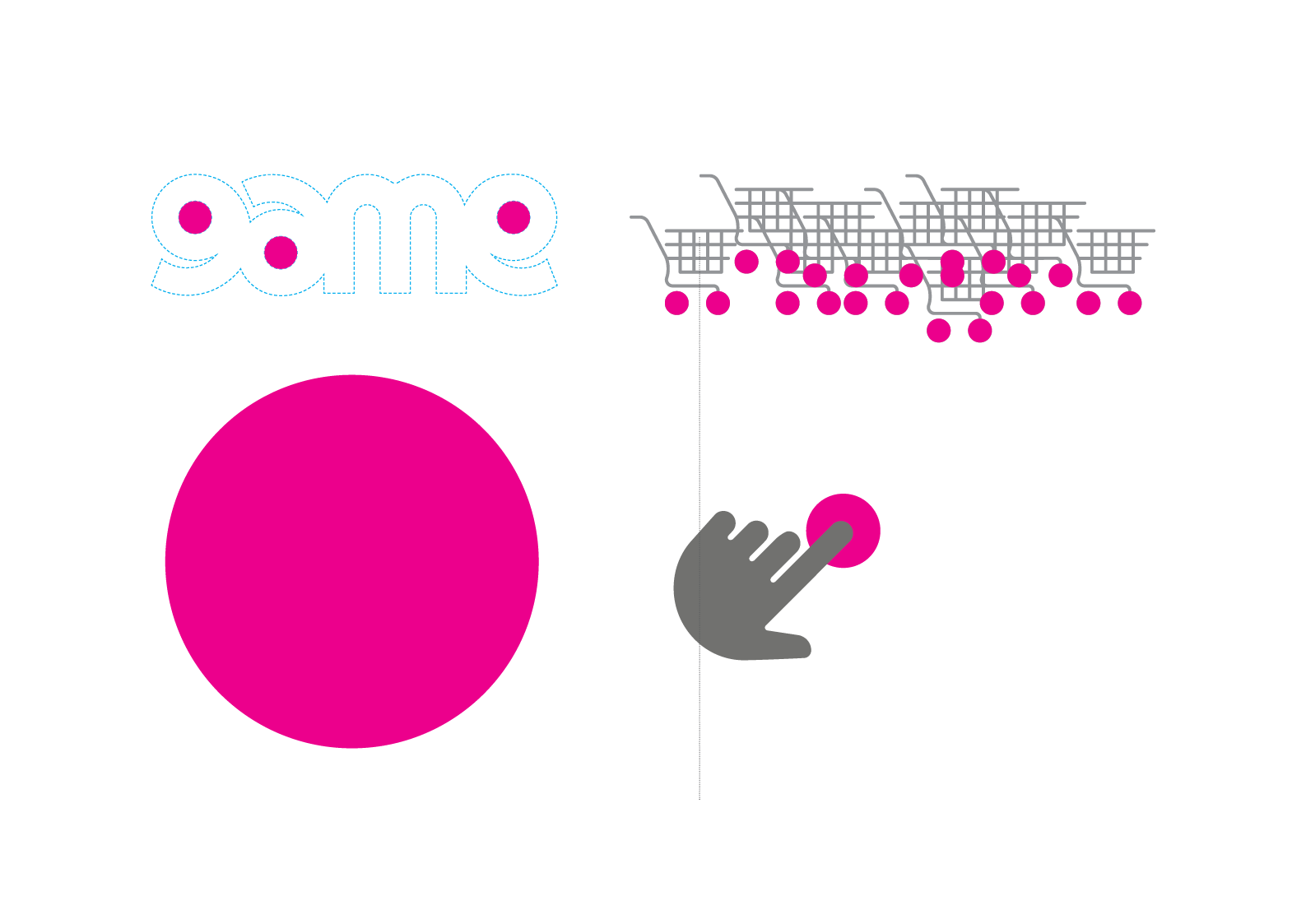

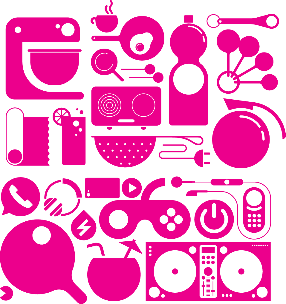
A more direct reference to the retail environment is a library of icons and pictographs that become a playful piece on lifestyle communication. The simple thread for these pictographs is that they find a natural place for the dot in their general construction. The style of graphic needs to be own-able, and thus needs to be visually informed by the dot.